HackerEarth’s public-facing website was redesigned to clarify messaging, streamline navigation, and strengthen conversion paths. The work focuses on information architecture, a cohesive visual system for the web, performance and accessibility improvements, and a scalable Webflow CMS for faster publishing.

Top-level menus and page hierarchies are simplified to reduce page-hopping and surface the next action sooner. Clear labels, consistent breadcrumbs, and purposeful cross-links guide visitors to demo, pricing, and case studies in fewer clicks. CTAs stay visible and predictable across the journey to minimize drop-off.
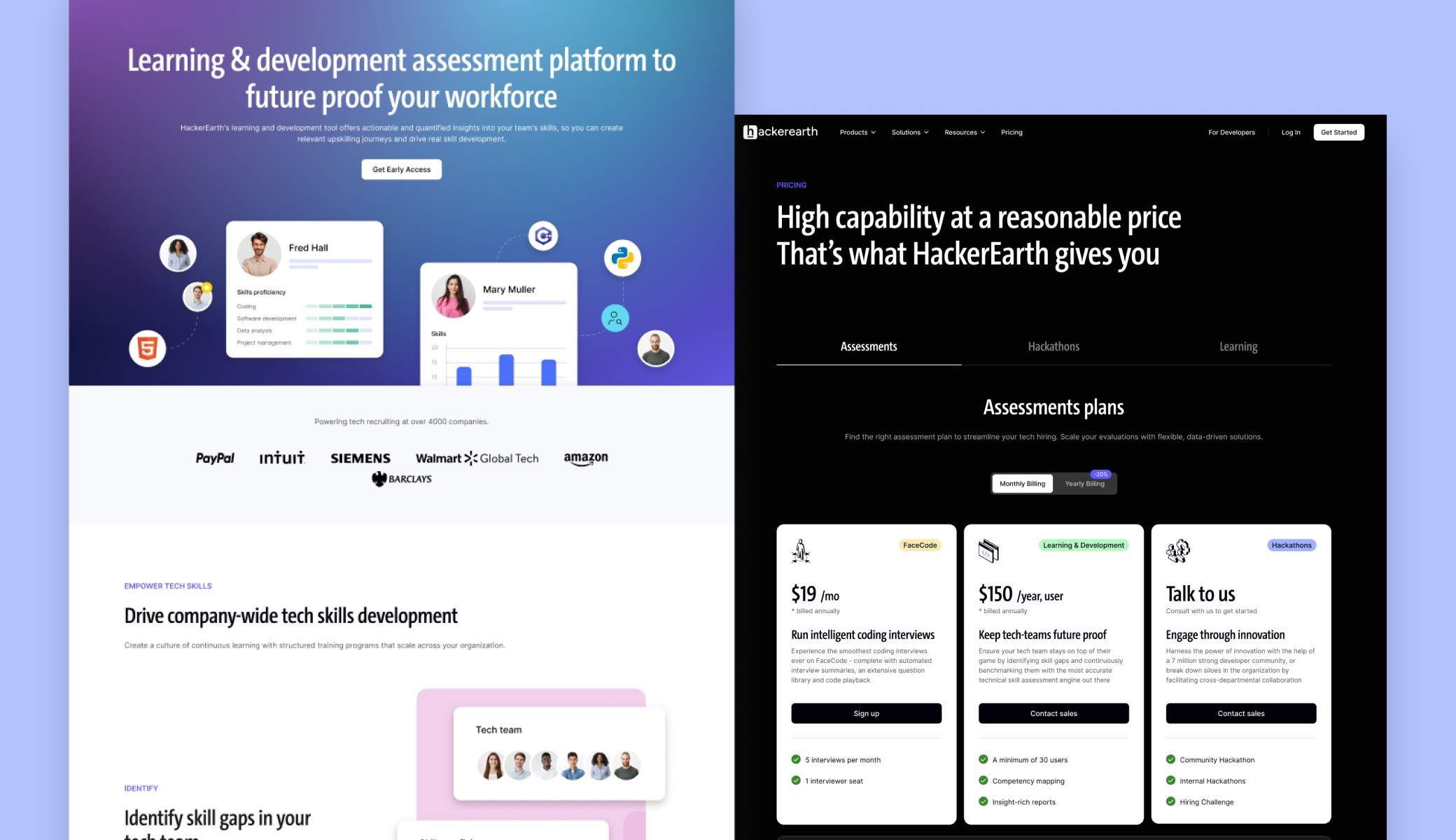
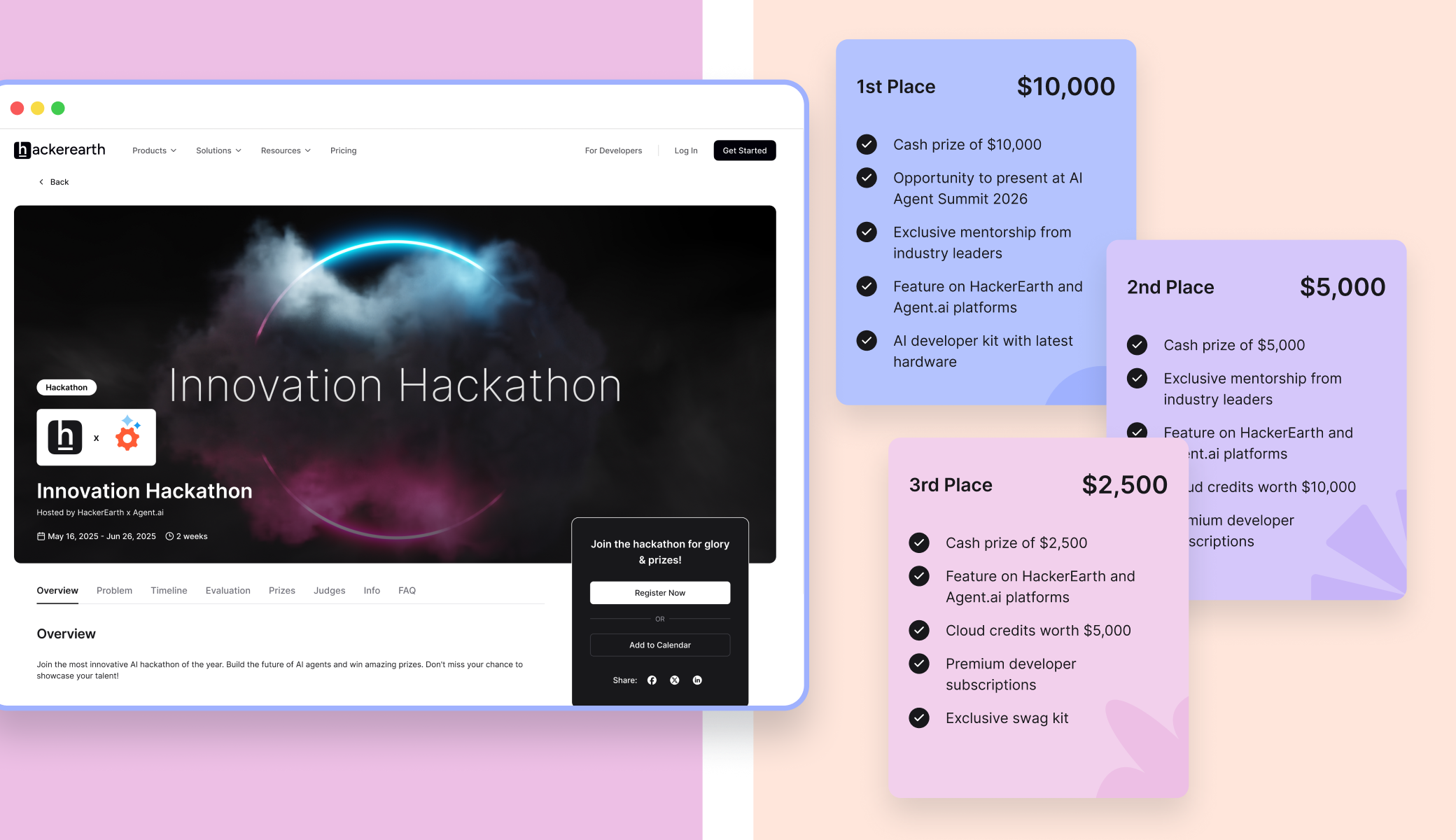
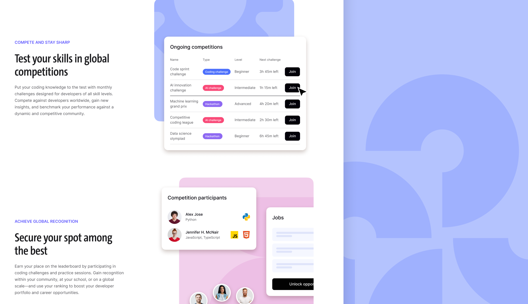
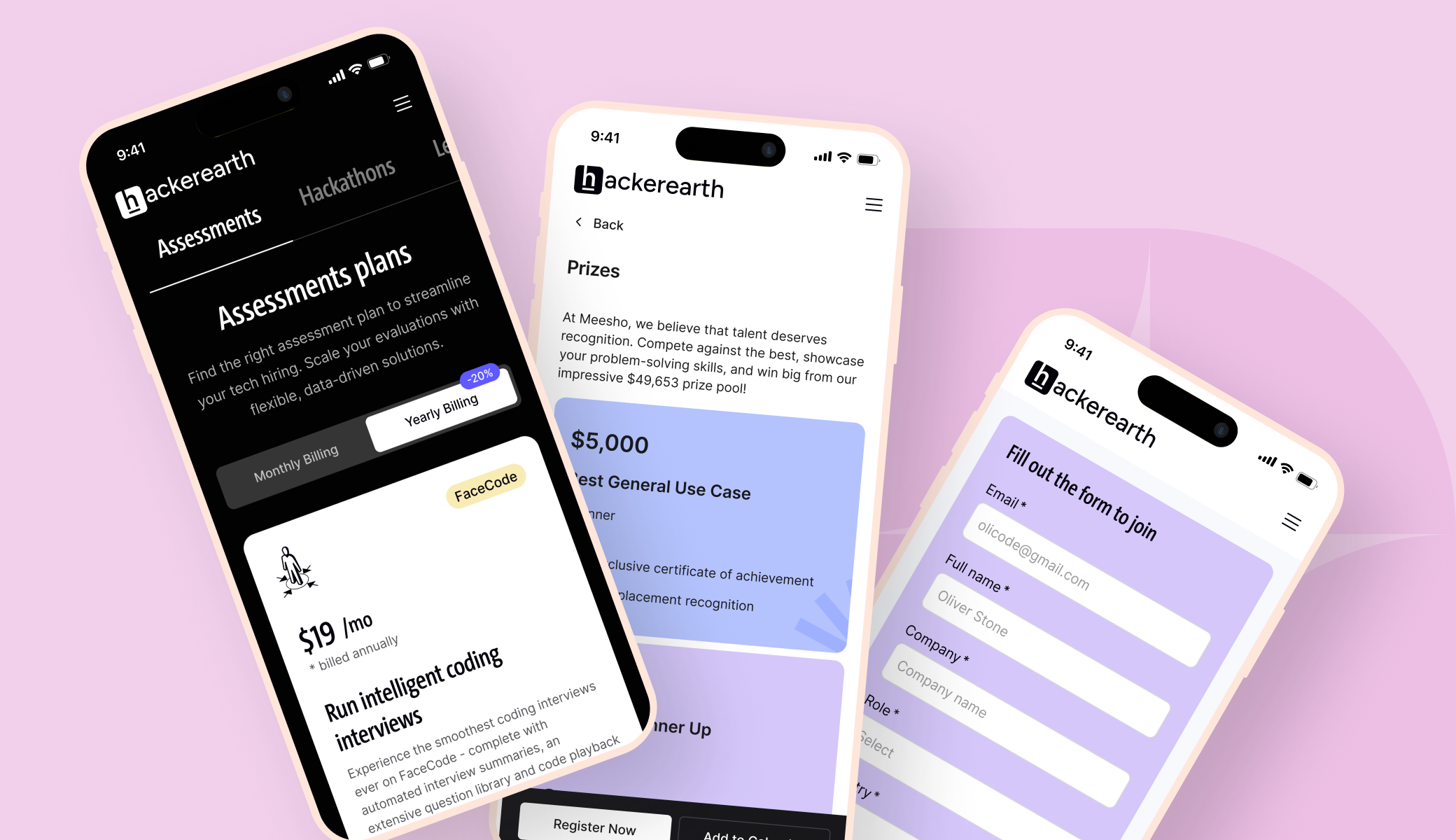
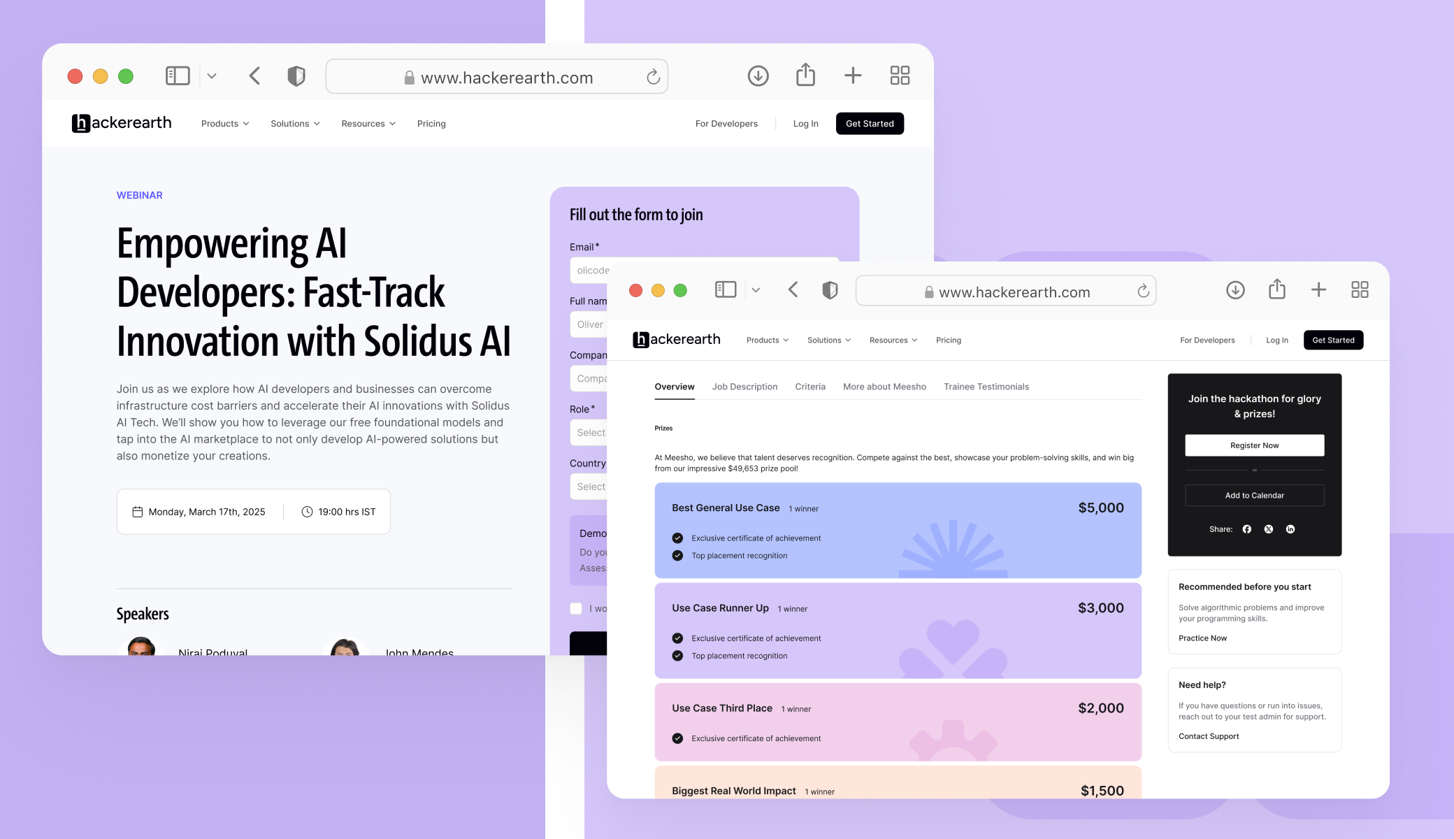
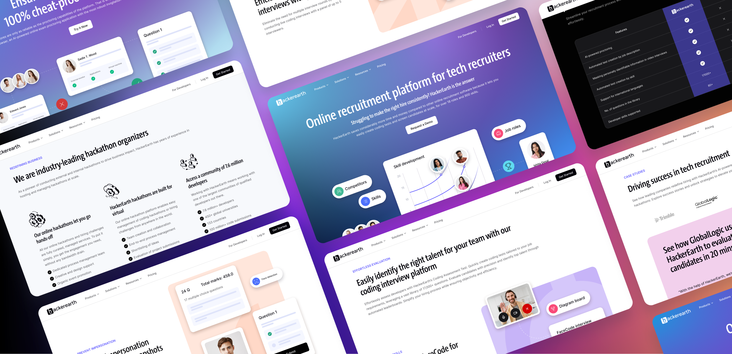
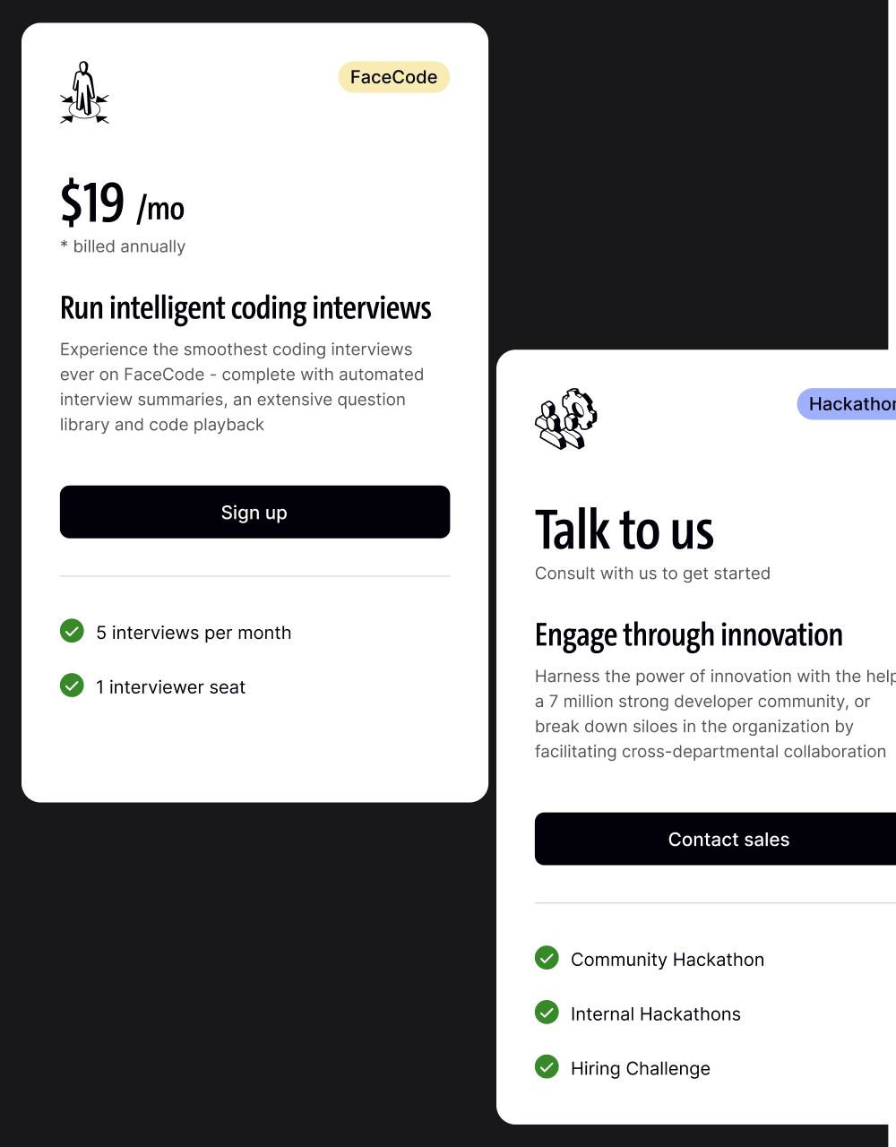
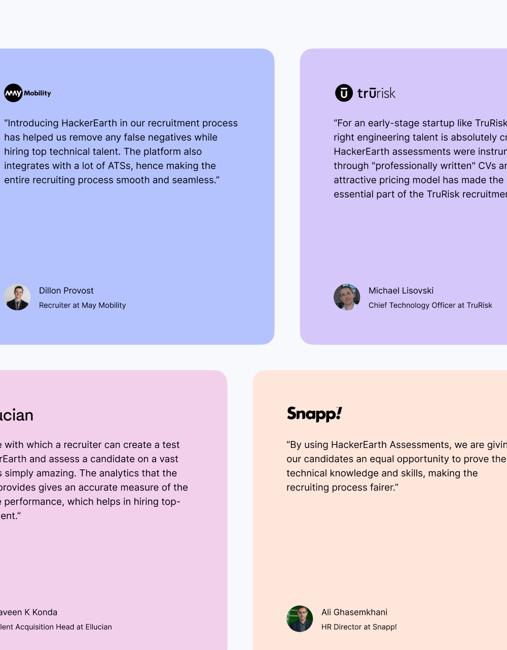
A balanced type scale, accessible color palette, and reusable sections (hero, feature rows, tabs, cards, comparison tables, FAQs) create visual consistency and faster comprehension. The system maintains brand precision while enabling rapid page creation without additional design cycles.


Layouts adapt cleanly across breakpoints with predictable patterns. Media and motion are optimized to strengthen Core Web Vitals. WCAG-minded practices—contrast, focus states, keyboard navigation, descriptive alt text—ensure inclusive access for all visitors.